Checklist: 7 Tricks To Nail Your Trade And Construction Website Homepage Design.
It’s the first place a client lands when visiting your T&C website.
Your homepage.
You have just a few seconds to make them feel they are in the right place.
And though many T&C businesses may have a website in use, they are missing some serious key factors on the homepage design that means clients think you don’t offer what they’re looking for.
Or look like they serve the calibre of client they are.
So off they trot, back to Google search and carry on looking down that list.
Perhaps landing on a competitor website.
❌ Not good.
If only there was a way you could keep their attention for longer.
And move them towards making an enquiry with you.
Well, there is.
And it starts by getting your website homepage design right.
Here's our 7 trick checklist we use to make sure our Trade and Construction website homepage designs do all the heavy lifting for our clients…
1. Tell us who your Trade and Construction business is in the first 2 seconds on your website homepage design.
The most important part of your website design.
In my humble opinion.
That when we land on your website, before we even begin to scroll, we know exactly who you are, what you do and who you serve in your Trade and Construction business.
Why?
Because we are all busy people.
And if we have to go hunting on your website to see if we are in the right place, we will more than likely be back to the Google search page in less than 3 seconds.
But how is this possible to give all this information in the first 2 seconds, I hear you cry?
Hold tight.
Because I’m about to tell you.
It's all in the Hero Banner (the first space at the top of every website).
1️⃣ Use text to tell us what you do i.e. Decorating, Building, Plumbing etc. We need this information, especially is your business name or logo doesn’t include this.
2️⃣ Use imagery that shows us your dream job and the kind of work you specialise in or want more of.
For example.
If I am a property developer and do big commercial projects, if the first image I see is of a small box room that has been decorated for a new baby, I’m likely going to think your business is too small to handle my work or that you focus only on small residential.
3️⃣ Use your company strap line or short USP (unique selling point) to give us a little bit more information about you and how you work.
This may/should be only a sentence or two, but will help build brand awareness (if it’s your strap line) or see why you’re different e.g. if you mention something along the lines of ‘Using only sustainable materials in our builds’.
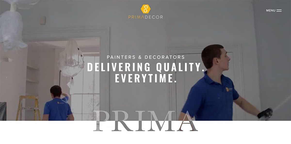
Here's an example of one of our client’s website homepages.
The image you see (behind the text) of the decorators is actually a video.
So not only are we introduced to the kind of premises the company specialise in, but we’re also seeing the team member’s faces, wearing clean and smart uniforms also.
In less than 2 seconds – WITHOUT SCROLLING – we get a sense of the company type we are dealing with.
It is possible to nail it in 2 seconds when done right. 👌🏽
2. Be sure to have a video on your Trade and Construction website homepage design.
Possibly my favourite trick.
Here’s all the reasons why.
✅ VIDEO ENCOURAGES VISITORS TO STAY ON YOUR WEBSITE LONGER.
If you think about it, when a visitor lands on your homepage and there is a promotional, service or testimonial video waiting for them, the likelihood is they are going to watch it.
If said video is 2-3 minutes long (provided your video is made of the good stuff) they are also likely to watch all, if not the majority of it.
Especially if the opening catches their attention.
So visitors end up staying put much longer than if they were to quickly scroll the text, not see what they are looking for and jump back to Google to look at the next Trade and Construction company that offers what you do.
✅ VIDEO HELPS WITH YOUR TRADE AND CONSTRUCTION WEBSITE SEO.
If visitors are staying on your website longer (because they are watching a video) then Google takes this that your website is of more interest to visitors.
Which goes a way towards helping your SEO and slowly working your website up the rankings.
⭐️ PRO TIP – Be sure your video is positioned relatively high up on your website homepage so that it catches the eye of your visitors quickly and encourages them to watch.
✅ VIDEO BUILDS QUICKER RELATIONSHIPS FOR YOUR TRADE AND CONSTRUCTION BUSINESS.
Video is the quickest, easiest and most powerful way to capture multi-dimensions of your Trade and Construction business.
You already know that trust building and positioning yourself as the go to expert amongst all the competition you have is one of your biggest challenges in your Trade and Construction business.
But showing up on video, with your team allows us to get to know you and your business before we even pick up the phone to enquire.
How do you think that affects the experience we have of you?
And clients.
Video allows us to hear directly from your Trade and Construction clients.
Take this promotional testimonial video for our decorating client as an example…
The video is less than 2 minutes long.
But we see the team at work.
We’re shown the type of job they are specialists for (large properties in Central London).
And we hear from the ideal client himself (Director of a Property Development Company).
The video captures our attention.
And ticks all the boxes for setting our first impression.
Keeping us on the website homepage for longer (to watch) and tips us over the edge to make an enquiry if we are after a high-quality decorating company… because we can see they clearly fit the bill.
3. Include a service list with links to specific pages on your Trade and Construction website homepage design.
This one is not only for better experience of your website for visitors.
But also to help your SEO.
Be sure to include links/buttons on your homepage that go straight to separate service pages.
For example.
You run a commercial maintenance company.
You will have a page specific to roofing.
A page specific to plumbing.
A page specific to electrical works.
Etc.
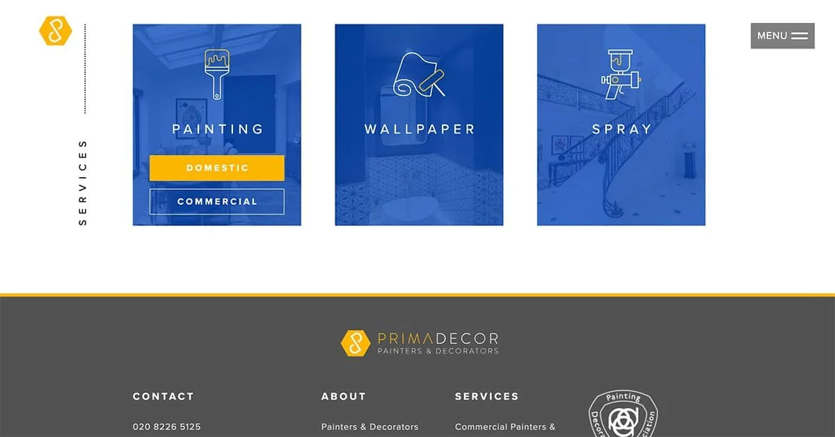
Look at this example for one of our decorator client’s websites:
When you hover over each button, the option to go to the domestic or commercial page pops up.
We have specific pages for both.
So.
✅ BETTER USER EXPERIENCE.
If we can jump to the pages we want to visit quickly and easily from your homepage, it means we get to making a decision about your business faster.
And when it comes to online, we like fast.
If your website is this streamlined and organised, how does the rest of your Trade and Construction business fair?
Hold you in good stead, right?
✅ HELPS YOUR SEO.
Google likes it when we click around on a website.
It tells the platform that the fact we are staying on your website and clicking to view other pages, that your website must be of interest.
Yes, we can hit your MENU button at the top and likely navigate to pages on your website we might be interested in.
But if we’ve already started scrolling, having those services displayed to us in a different way – like those buttons in our decorator’s example – could encourage us to click through.
We’ve got more chance of capturing a visitor’s attention.
And it’s a great way to upsell different services that we might be interested in.
4. Use more words on your Trade and Construction website homepage design.
Images and videos are great for brand awareness.
Learning about your team.
Your clients.
Your business.
But if you want your website to start working it’s place to the first page of Google, then you need to be taking into account the quantity and quality of words you are using.
Now.
SEO is a tough one to crack.
And top companies pay thousands of pounds a month to compete in those Google rankings.
But there is a lot we can do to get our websites on the right track from the off.
And text plays a huge part in this.
Because this is what Google is scrolling through to try to match your website up with what people are searching for.
After all, Google will only remain the number one search engine if it is giving its customers what they want…
…The quickest, easiest, and best search solutions out there.
We found this.
‘Forbes indicates that an average of 600-700 words per page is optimal for SEO.
Forbes also states that websites with less than 300 words per page are considered “thin” by Google’s standards and, most likely, won’t rank as highly in search.’
I want to share with you a little trick we use to help get more words on a page.
Without it clogging up your website homepage or turning the page into a 3mile long scrolling experience.
⭐️ PRO TIP – Use ‘Frequently Asked Questions’ panels to help boost your word count as well as provide key information visitors are looking for in your Trade and Construction business, in a clean, structured way.
5. Include photos from your Trade and Construction business only of Ideal Client work and projects.
A quick lesson in Marketing.
Only show images of the kind of work you want more of.
❌ Don’t promote the kind of Trade and Construction work you loathe just because you’ve got photos of it.
Why?
Because all you are doing is drawing attention to that kind of work and encouraging those kind of enquiries.
Also.
Imagine you are a high end bathroom refurbishment company.
Specialising in luxury bathrooms.
If, when a visitor who is in the market for a high spec, luxury bathroom lands on your homepage and every photo and image they see there is only of luxury bathrooms, then they are more likely to feel they are in the right place to enquire.
VS.
Imagine that same customer lands on your homepage and they see some images of budget bathrooms that you have uploaded because you haven’t’ got round to uploading the high end ones?
Do you think that customer is going to think they are in the wrong place?
And jump back to Google search?
And likely never give your company a second glance again, purely because they don’t think you are the experts for them?
Images matter.
So be picky.
Show less.
But show the work of the ideal jobs you want more of in your business.
So take the time to capture epic photos.
They will do a whole lot of the heavy lifting in your Trade and Construction business for you.
6. Highlight at least one testimonial on your Trade and Construction website homepage from an Ideal Client.
You could sing your own praises until your heart’s content on your website.
Telling us all how brilliant your company is.
But there is nothing more powerful than when a happy client does the job for you in the form of a testimonial.
Why?
👌🏽 It validates your business.
👌🏽 Gives us a sense of how experienced you are.
👌🏽 Their stories allow us to relate to your customers.
So make sure that on your homepage you have at least one testimonial.
More than likely you will use a review left on your Facebook, LinkedIn or Google My Business page.
Testimonials dotted around your website should be extracts.
In other words, don’t use the whole review but take an extract.
A line or two that really brings home why your Trade and Construction business is the company of choice.
And for your homepage?
Use the absolute best extract possible.
It's got a prime time slot.
So make it a good one.
And make sure the testimonial you choose to feature in your Trade and Construction website homepage is from an ideal client.
For example.
If you are a domestic trade, you might note underneath the testimonial itself…
Jane Palmer
Homeowner, North London.
…if your ideal clients are homeowners in North London.
Similarly if you are a commercial Trade and Construction company then underneath your testimonial of choice might read like…
Jack Sparrow
Head of Operations, McMullen’s Pub Group.
Include the name, job title and company name.
Because this allows other Operations Heads or people involved in similar Pub groups to see your Trade and Construction company is experienced in this field.
🍪 And for extra brownie points?
As well as a written extract of a testimonial, you also have a video testimonial from another ideal client sitting on your homepage.
💥
7. Make it easy for your clients to contact you directly from your Trade and Construction website homepage.
And I’m not talking about your phone number always visible at the top of the page.
Though this is a good start.
I’m talking about a CALL TO ACTION.
This basically means a nudge on the page to get visitors to contact you.
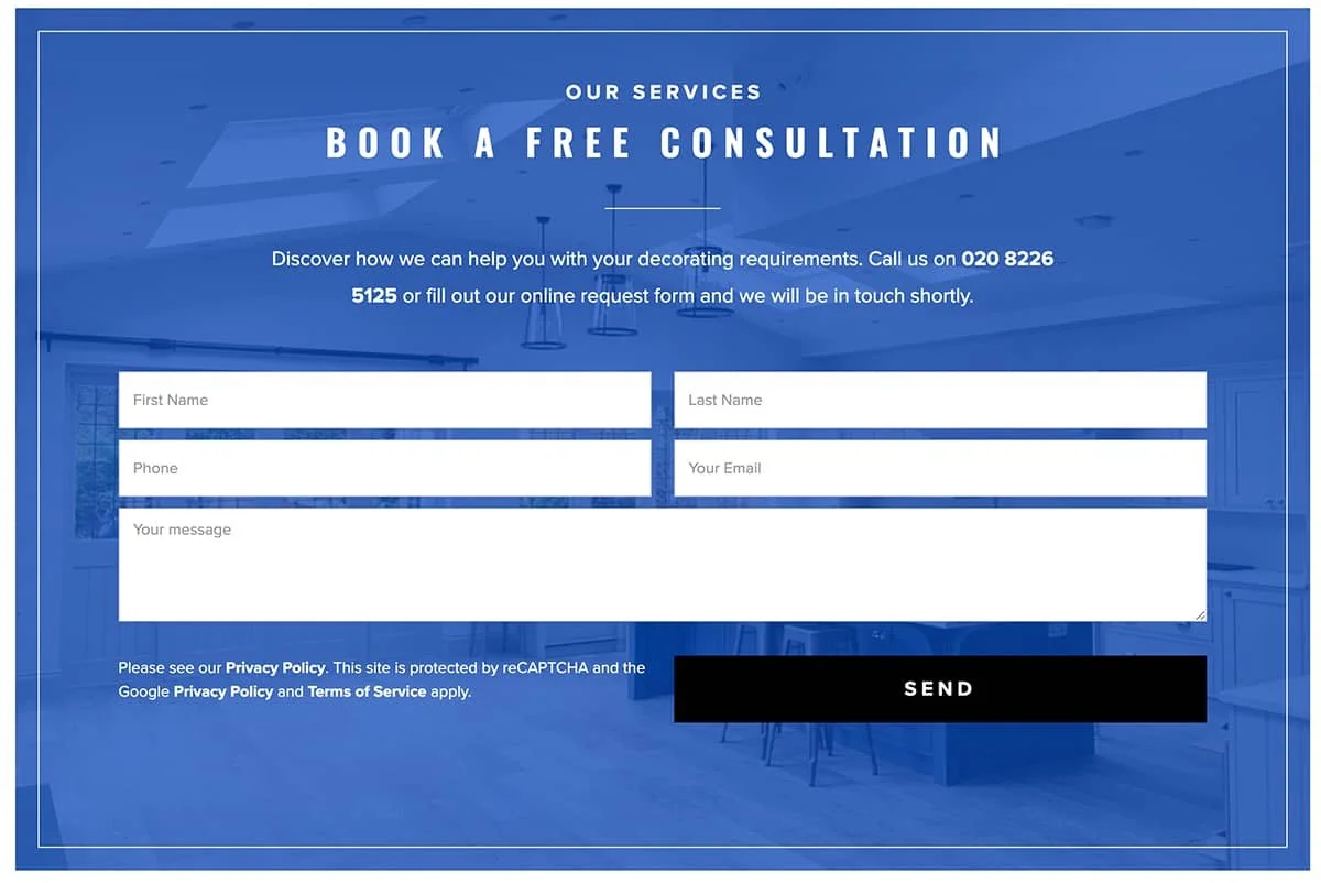
Take a look at this example.
This quick and easy form features halfway down the homepage design.
So visitors can quickly and easily get in touch with our client.
There is of course the company phone number at the top of the website.
As well as the CONTACT page in the menu.
There is also the phone and email links in the footer (the very bottom section of a website).
There are tonnes of ‘contact’ touch points on the homepage alone.
To make it quick and easy for visitors to get in touch and enquire no matter where they are on the page – top, middle, or bottom.
I advise you do the same.
And depending on how much content is on your homepage you may even want a few more CALLS TO ACTION in the middle section.
⭐️ PRO TIP - According to our SEO team, having a form on the homepage ready to enquire rather than redirecting to a contact page converts visitors better.
You’re welcome.
⬇️ 7 Tricks To Nail Your Trade And Construction Website Homepage Design Rundown:
1. Tell us who you are, who you serve and what you do in the first second.
2. Use video.
3. Include your service list with links to specific pages.
4. Use more words. 600 – 700 per page is considered epic.
5. Promote photos and images of ideal clients and ideal client work.
6. Highlight at least one testimonial.
7. Make it easy for clients for contact you directly from your Homepage.
🛠 Need a little more help nailing your website for your Trades and Construction brand and marketing?
Course you do.
First. Let’s work out where you are with all things Websites.
Got 3 minutes?
Take our Trades Quiz to discover how you score with all things ‘Off The Tools’.
We have heaps of tips, tricks, and hacks for your Trade and Construction business in our cheat sheets, videos and ideas waiting for you on the other side… i.e., your results page.
So, you can improve your score. And NAIL your Trade and Construction business.
Nice.


